Improving user understanding with a transparent colour-coded grading system

The Breeding feature in Rival Stars Horse Racing is a core loop players need to engage with to progress and master the game.
.png)
As a player:
Based on observations within the community, historical user testing data and an investigation into the back end system, we focused on the first two motivations.
Breeding for stats is essential for game progression and important to master for high ranked players who want to be competitive in our live races.
.png)
We identified two problems with the stat inheritance system when breeding:


Based on ideation sessions with the wider team, secondary research and the current UI of Rival Stars Horse Racing, a series of concepts were generated:

We chose the letter grading concept for 3 core reasons:


%2022s%20(1).png)
As we cater to a global audience, there was a concern that the letter grading system might not be universally recognised.
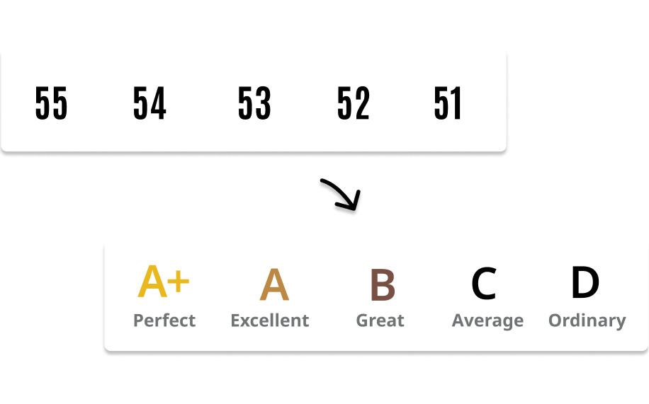
To enhance the letter grading system and assist players unfamiliar with it, we introduced color coding for additional clarity.
Gold was chosen for the top as it's widely recognized to represent success and excellence across various cultures.

When thinking about naming conventions, we went with "Training Potential" as this was a representation of how high players could train their horses.
%2022s%20(1).png)
We weren't too sure about the player facing terminology, this was something we needed to test and gauge with players.
Once a players foal was revealed, stat quality wasn't the most important information, the number or "Trained Stats" were.
This resulted in needing to reveal these in a satisfying and informative way to players, which was mocked up in a Figma prototype.
We took this opportunity to improve the supporting information for both breeding and stats by doing the following:
Using the existing Breeding Guide, this process was peer reviewed by Community, Tech, Design, UX and Product departments.

We located the Guide on the Breeding Screen as it is the most contextual place for players to access on-demand information.
%2022s%20(1).png)
Having the Breeding Guide in-game added a third layer of in-depth information, allowing Rival Stars to be more targeted across other areas of the game.
The existing information popup, which appeared across all stat-critical game areas, offered general and repetitive information rather than goal-specific insights.

The improvement aimed to give contextualised information about that particular horse’s stats, giving them valuable support throughout the game rather than generic content.
The proposed plan would have two versions, switching the hierarchy of information depending where it's accessed from e.g. Breeding is focused on Stat Quality and Racing is focused on Trained Stats.


We interviewed 6 existing players, varying in game progress, spending behavior, and country.
Existing players were identified as the most at-risk group for this change, as they were accustomed to the current system.
For user testing I set up the prototype and testing protocol while the Games User Research team sourced and conducted the testing.
Our focus was testing the following:
Clarify Stat Grading Comprehension:
Determine if players clearly understand the grading scale, particularly if an "A+" grade is perceived as high quality, especially with players who aren’t from western countries.
Assess Color System Effectiveness:
Evaluate whether the color coding system is intuitive and effectively communicates stat information.
Examine Clarity Between Grading Scales:
Investigate if switching between letters and numerical values causes confusion for players.
Understand Stat Significance:
Test player understanding of the contextual importance of stat qualities versus numerical stats in decision-making processes.
Evaluate Stat Card Usability:
Assess the new stat card's user-friendliness, focusing on the ease of toggling between stat quality, numerical stats, and preferences.
Intuitive Letter Grading System:
The letter grade system for stats is intuitive, allowing players to easily identify good and bad stats for players from western and non-western countries.
“A+ means best and D is worst - easy to figure out how good a stat is of a horse. Its likely easier for new players.”
Noticeable Stat Colouring:
Players commented on the colouring of stats, which makes it easier to determine if a stat is good, especially on the Foal Screen.
“Currently the numbers are all grey and black which makes it hard to differentiate, but I can see the maximum stat already”
Switch to Numerical Stats:
Changing from letter to number stats in the foal screen is beneficial for players.
"I like that when the foal came in it showed me letters then flipped to stats. and it's easier to keep track of with the colour values being the same"
Confusing Terminology:
Players found the term 'Training Potential' confusing as it suggests that the stat is related to training.
Lack of Exploration:
Experienced players likely will not explore 'i/information' buttons.
Confusing Button Design:
The cycle stat information button resembles a refresh button, causing confusion.
"the button looked like refresh and was scary - what if I lose everything? Haha I didn't want to press the icon - as it was not present earlier and was scared to lose the stats”

Swapped the "refresh" icons to a switcher in the header, improving the proximity for the action and enabling us to use this in other areas of the game.
From further community research we changed from “Training Potential” to “Base Stats”.
Changed the iconography to an expand icon to help visually communicate the new paradigm of information.


%2022s%20(1).png)
Despite improvements on more reliable stats, some players were still disappointed at their breeding result. Being able to see the stats clearly surfaced the game mechanics more.
Overall this release was well received and largely successful. However, we identified several opportunities to build on this success:
Breeding Guide Badging Bug:
Badging in the first time user experience caused information overload for new players. This was addressed in the next release.
Breeding guide design - Needs redesign for better adaptability across screen sizes and languages.
Nav dots for horse swiping: these were now being visually linked to the switcher instead of indicating the horse could be swiped.

.png)
Reducing cognitive load by transitioning from nested menus to a scalable hub framework.

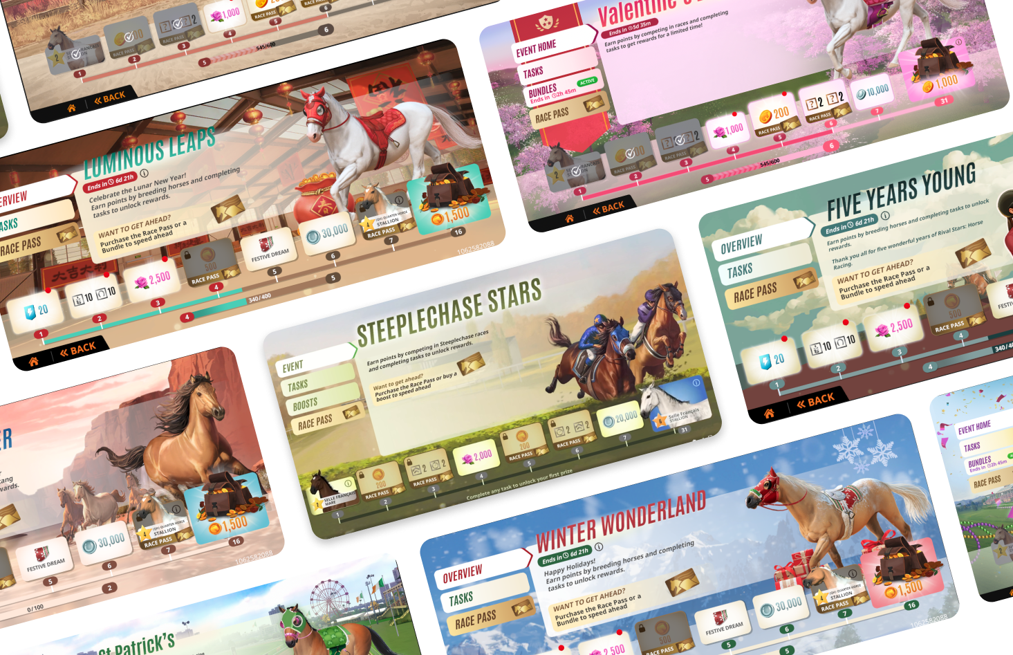
Elevating Player Engagement and Revenue in Rival Stars Horse Racing Through Strategic Event Design


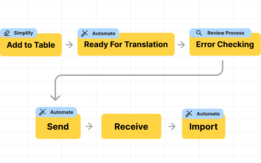
Creating scalable solutions for translation management
