Restructuring Core Navigation
Reducing cognitive load by transitioning from nested menus to a scalable hub framework.
Overview
- Role: Senior UX Designer (Project Lead)
- Duration: 4 Weeks (2 Sprints)
- Context: Pre-release Mobile Product
The Challenge
Following a strategic pivot, the legacy "Phone" navigation became a critical bottleneck. It prioritised visual immersion over basic usability, failing to support the new core progression loop. High interaction costs buried key features, and a lack of visual hierarchy created choice paralysis, risking our upcoming launch deadline.
The Aim
To design a scalable, hub-and-spoke framework that reduces cognitive load, clearly surfaces revenue drivers, and aligns with mobile usability best practices prior to launch.
Release Impact
100% navigation success rate achieved in recent user tests by moving from a confusing "Phone" interface to a streamlined Hub.
Absorbed 4+ major feature updates during pre-release testing with zero UI refactoring required, proving a highly scalable architecture.
De-Risked Launch by identifying and removing navigation bottlenecks prior to development, allowing engineering to focus on core product polish.
- 1
Identify: Conducted heuristic analysis to identify navigation bottlenecks prior to development.
- 2
Map & Align: Created the Hub-and-Spoke framework to align user flows with business goals.
- 3
Iterate & Finalise: Used prototype findings to validate the pivot, removing the phone layer entirely to prioritise clarity.
- 4
Support Build: Oversaw the greybox implementation, establishing the rules for the final Hub grid.
The UX Problem
Diagnostic Audit & Legacy IA
Mapping the legacy architecture revealed a fragile system unable to support the product's expanding scope.
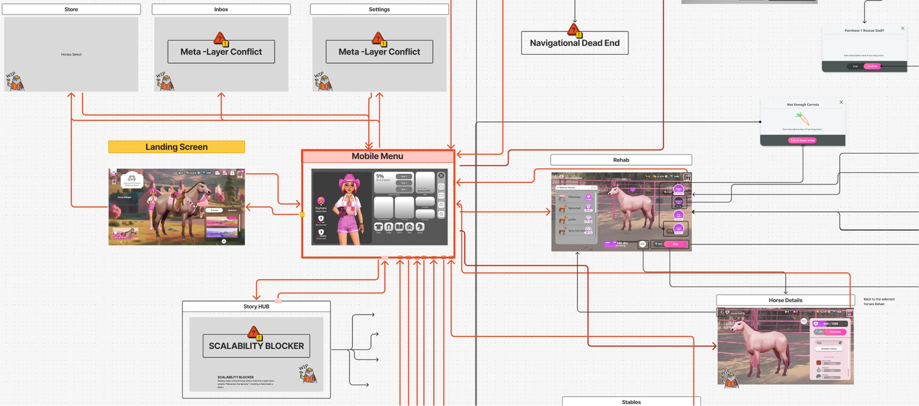
Analysis
- High Interaction Cost & Dead Ends: Core loops were buried behind 4+ taps. Inconsistent "Back" button behaviour frequently trapped users in deep sub-menus, creating logic dead ends.
- Unfamiliar Paradigm: Forcing users to open a nested "phone" menu for every interaction created a jarring modal interrupt that deviated from standard mobile patterns.
The Design Solution
I narrowed the approach down to two primary directions to present to the product manager and engineering teams:
Option 1: The "Open World" Model
Primary navigation points live directly on the main screen. However, technical constraints prevented lateral tabs between screens, creating a "pogo-stick" effect where users were forced to constantly bounce back to the main menu for every task switch.
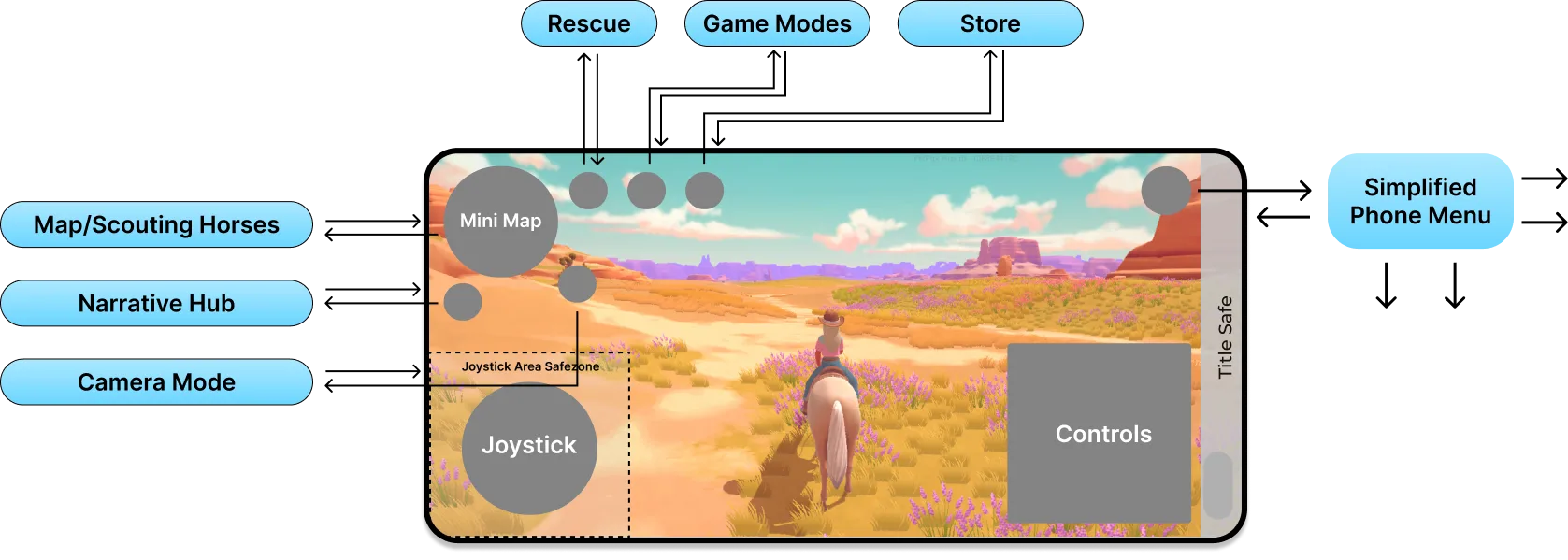
✅ POSITIVES
- High Immersion: Keeps the user grounded in the 3D world.
⚠️ NEGATIVES
- High Interaction Cost: Lack of lateral navigation created inefficient silos, breaking user flow.
- Production Risk: The studio lacked an existing pipeline for 3D-integrated UI, presenting significant timeline risk.
- Monetisation Friction: Overlay menus offered poor visibility for in-game storefronts, reducing revenue opportunities.
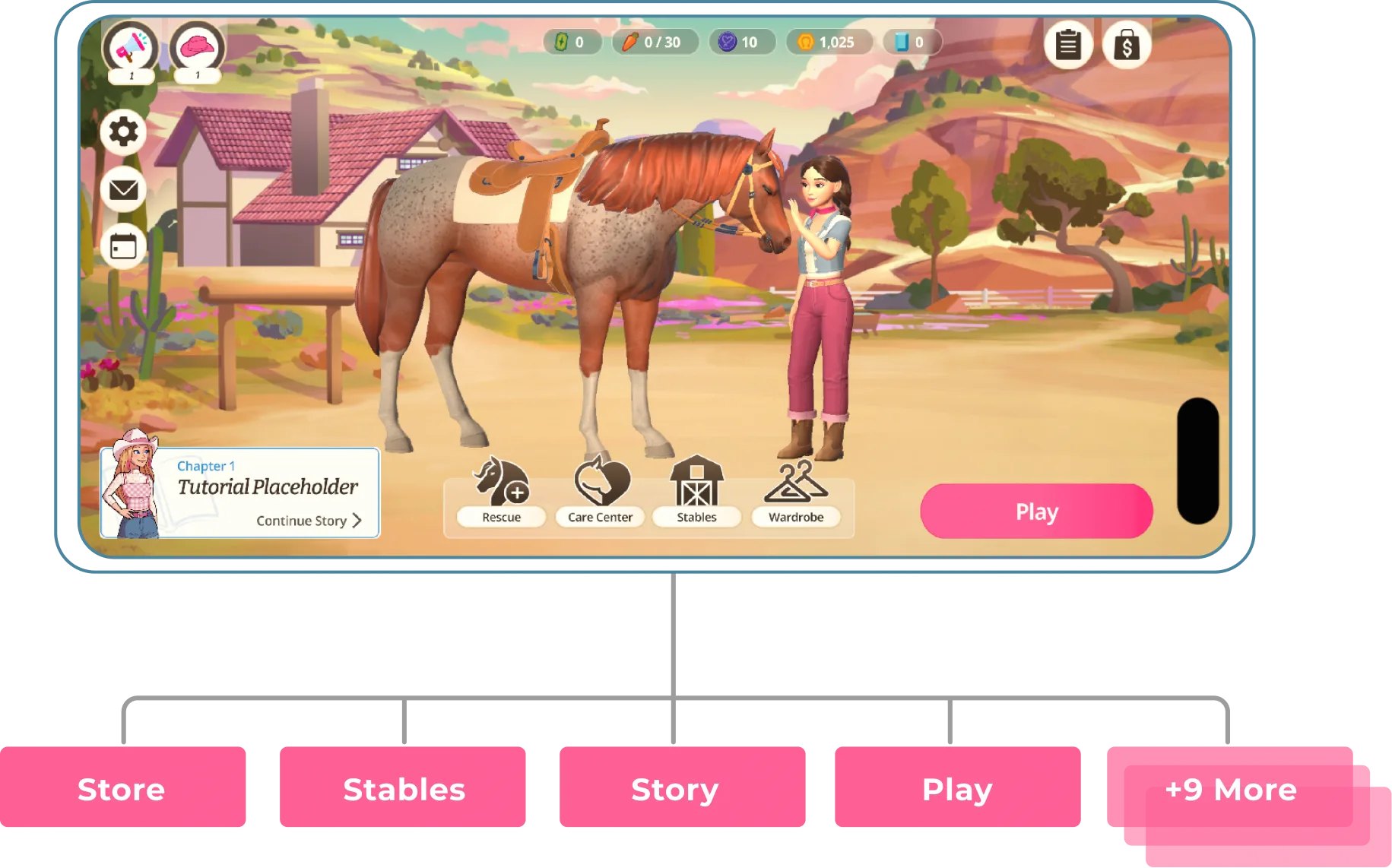
Option 2: Hub & Spoke (Chosen Design)
Adopts an industry-standard Hub model to minimise onboarding friction and centralise the user journey.

✅ POSITIVES
- Validated Pattern: Leverages navigation standards already proven in our portfolio.
- Low Risk: Removes the technical complexity of 3D-integrated UI.
- Production Speed: Feasible to implement within the tight pre-release window.
⚠️ NEGATIVES
- Immersion Break: Removes the user from the 3D world context (a necessary trade-off for usability).
The Verdict: We selected the Hub & Spoke direction to prioritise clarity over immersion. Testing confirmed this decision, achieving a 100% navigation success rate in subsequent user tests compared to the confusion of the legacy model.
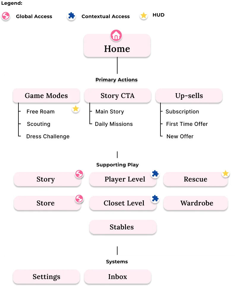
The Hub Architecture
To resolve the "pogo-sticking" issue, I developed a three-tier architecture that balances immersion with access to key business drivers.
Tier 1: Core Engagement & Revenue Game Modes and Monetization are surfaced at the top level. This ensures entry points are always one click away, directly impacting long-term player retention and revenue.
Tier 2: Management & Preparation Grouped "admin" loops (Wardrobe, Stables) to separate preparation from active gameplay. This reduces cognitive load by keeping the user’s focus on the primary task at hand.
Tier 3: Contextual Access System menus like Settings are available without cluttering the interface during high-action moments. These remain reachable via a single tap but stay hidden during active play.
Notification Strategy
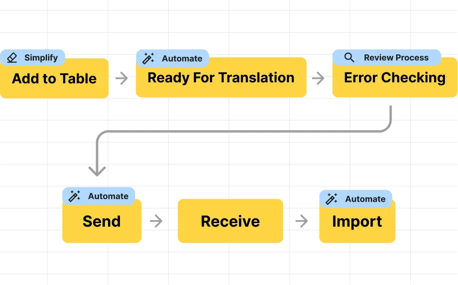
With the core architecture in place to handle manual navigation, the next challenge was managing automated alerts. In a feature-rich product, "Alert Fatigue" is a major risk. To manage cognitive load, I designed a dual-layer notification system based on urgency:
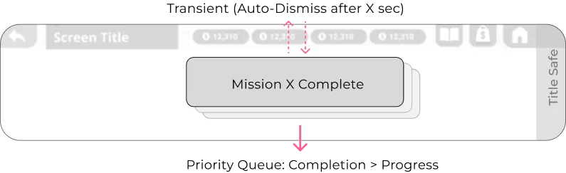
The Active Layer (Toasts)
Transient, high-motion alerts for immediate gratification (e.g., Level Ups). These use a priority queue where completion events always override incremental progress.
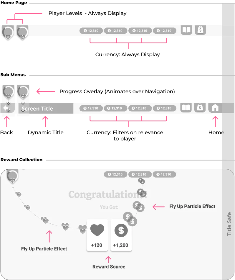
The Passive Layer (Badging)
Persistent anchors for deferred actions. I utilized a "Progressive Disclosure" model to reduce visual noise as the user navigates deeper into the menus.
- 1
Top-Level: Compact Indicators
 To keep the main screen clean, a simple dot shows there is a new item without distracting the user from their active session.
 - 2
Sub-Menus: Explicit Context
 As the user opens a menu, the UI expands to show specific text and numbers (e.g., "Rewards Ready"). This uses the extra screen space to clearly explain the reward and encourage interaction.
Impact and Evolution
Final Implementation
The transition from the "Phone" interface to the Hub resulted in a significant reduction in interaction cost and required zero UI structural changes during our initial market launch.
Future Iterations
Post-launch feedback highlighted a mental model conflict within the "Play" menu. Currently, Structured Tasks and Unstructured Exploration (Free Roam) are grouped together, which contradicts our onboarding.
- Elevate "Free Roam": Extracting Free Roam from the nested menu and making it a top-level Hub action reduces friction for the most frequent user behaviour.
- Refocus "Play": Dedicating this button exclusively to structured instances makes the user's choice more intentional.
- Align with Onboarding: Removing secondary tasks from the menu reinforces the discovery loop taught during the tutorial.