Making Stats Meaningful
Improving user understanding with a transparent, colour-coded grading system and in-game guides.
Overview
- Role: UX/Product Designer
- Duration: 3 Weeks
- Context: Core Game Progression Loop
The Challenge
Breeding for high stats is a core progression and monetisation loop in Rival Stars. However, the existing system relied on hidden maths and flat numbers. Outcomes were highly unpredictable, forcing players to rely on external spreadsheets to make sense of the game's mechanics.
The Aim
To design a transparent, intuitive stat grading system that empowers players to strategise their breeding with confidence natively within the game.
Release Impact
Improved Comprehension: Validated a letter and colour grading system that was universally understood by a global audience.
Reduced Cognitive Load: Restructured the interface to deliver goal-specific, contextual insights rather than generic popups.
High Community Sentiment: The update successfully demystified the breeding maths, resulting in overwhelmingly positive player feedback.
- 1
Identify & Audit: Mapped the hidden mathematical probability curves and analysed player sentiment to understand the core friction.
- 2
Architecture & Grading: Designed a dual-indicator (letter and colour) grading system to translate raw data into universally understood values.
- 3
Prototyping & User Testing: Rapidly tested the new UI with high-value players, pivoting the "refresh" icon to safe carousel arrows based on direct feedback.
- 4
Implementation & Launch: Consolidated complex rules into an in-game Breeding Guide and balanced the distribution curve with Game Design before launch.
The Problem
We identified two major pain points with the stat inheritance system during breeding:
- While the system was designed with intentional randomness, the output felt too unpredictable, often leading to player disappointment and frustration.
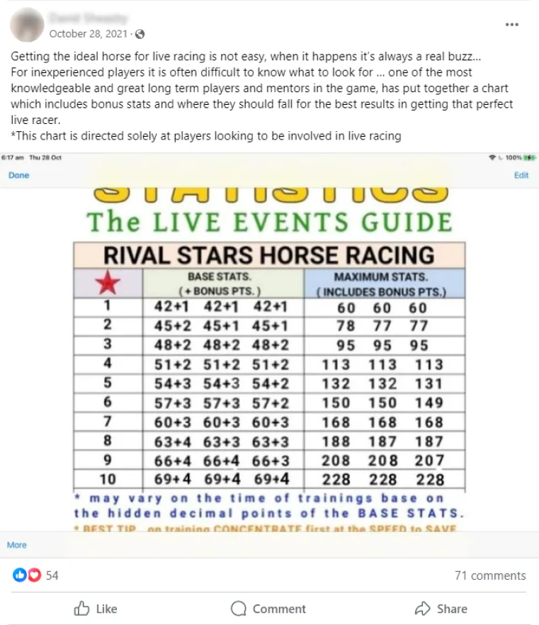
- Players had to build complex Excel sheets and keep handwritten notes just to make sense of the game's core breeding loop.
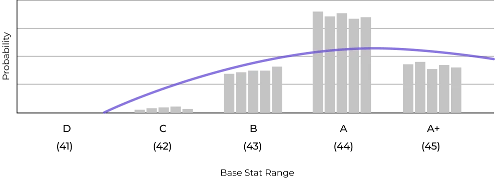
Diagram 1.0 - The stat progression system
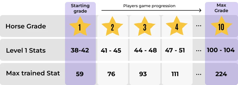
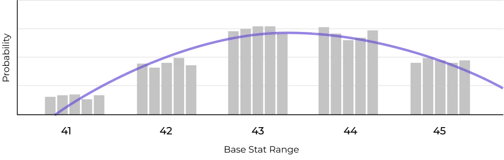
Diagram 1.1 - The wide probability spread
The Player Experience
Because the UI only surfaced flat numbers, players were left completely in the dark regarding their horse's true potential. This lack of transparency caused immense frustration in the community, creating high friction in a core loop.
To cope, players were forced to create complex, fan-made databases just to track performance.
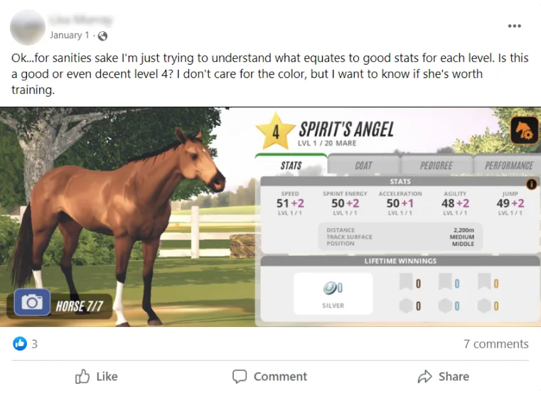
"OK...for sanity's sake I'm just trying to understand what equates to good stats for each level. Is this a good or even decent level 4?"
"Is this horse good?? I have interest to buy this one..."

"For inexperienced players it is often difficult to know what to look for."
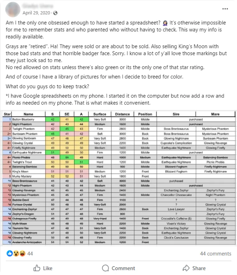
"Am I the only one obsessed enough to have started a spreadsheet? It's otherwise impossible for me to remember stats and who parented who without having to check."
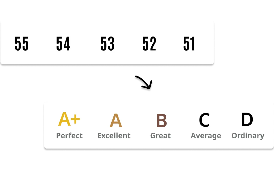
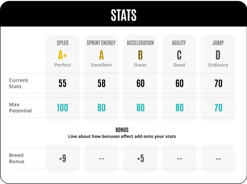
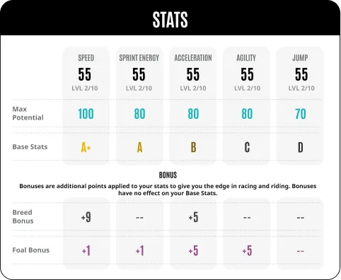
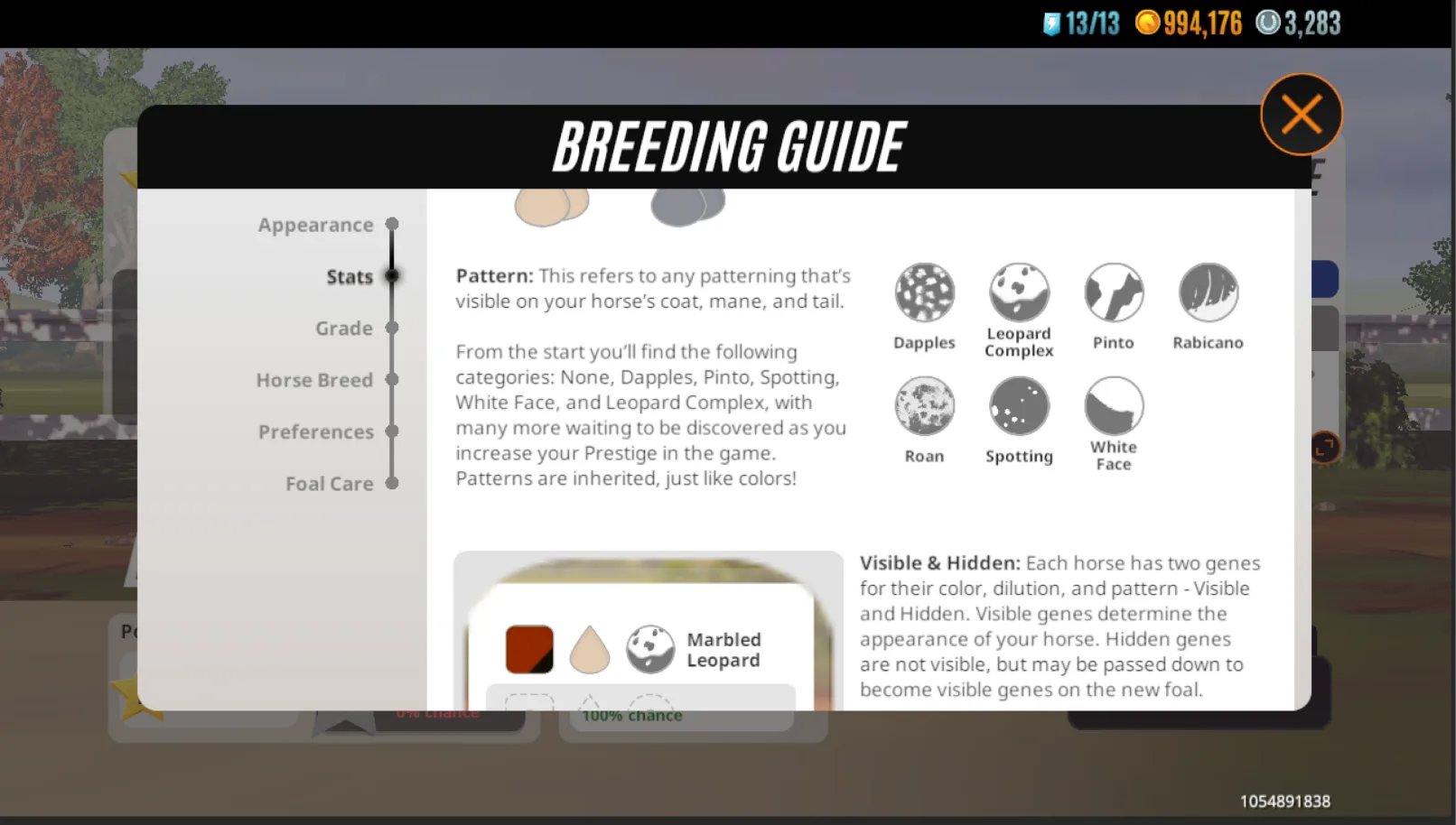
The Grading System
We needed a system that was instantly recognisable without cluttering the UI. We designed a dual-indicator system:
- Letter Grading (A+ to D): Adopted a standard Western educational scale to communicate baseline quality instantly.
- Colour Grading: Layered a colour-coding system over the letters to ensure universal comprehension for non-Western players.

Contextual UI
The old UI was a "one-size-fits-all" popup. I redesigned it to adapt to the player's immediate goals depending on what screen they were on:
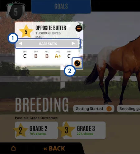
Breeding Screen
Goal: Genetics. The UI puts the Letter Grades (potential) at the top so players can quickly compare quality for breeding.
Racing Screen
Goal: Performance. The hierarchy flips. It puts the Trained Stats (numbers) at the top, as that’s what matters most during active gameplay.
Consolidating Knowledge
To keep the main screens clean, we moved the deep-dive technical rules into a dedicated Breeding Guide accessible directly on the screen. This allowed us to keep the stat popups lean and focused on data, while still providing a "one-stop shop" for players who wanted to understand the deeper mechanics.
User Testing & UX Pivots
Working with the Games User Research team, we tested the prototype with existing high-value players. While the grading system was universally understood, testing revealed critical UI friction points that required immediate iteration:
- Friction: The legacy UI used a global "Display" toggle located far away from the actual horse cards. Crucially, it used a "refresh" icon (a circular arrow). Players interpreted this as a destructive action—fearing that clicking it would re-roll their horse's stats.
- Pivot (Law of Proximity): I moved the toggle directly onto the individual horse cards, placing the control exactly where the data is modified. We replaced the scary refresh icon with safe, familiar carousel arrows, allowing players to cycle through views without fear of losing progress.
- Friction: Players found the proposed term "Training Potential" confusing, assuming it related to gameplay mini-games.
- Pivot: Switched terminology to "Base Stats" to clearly separate genetics from gameplay mechanics.
Official Release
This overhaul was a major update for the game, completely changing how players engaged with the core loop. To help transition the player base, the studio released an official developer update video highlighting the new mechanics.
Balancing the Game Economy
In collaboration with Game Design, we adjusted the underlying math to generate fairer, more predictable stats. This ensured players were actually rewarded for their effort, balancing user satisfaction with the game's monetization economy.
Community Response
The release successfully demystified the breeding maths. Players immediately understood the quality of their foals without relying on external spreadsheets. By surfacing the mechanics clearly, we restored a sense of fairness and strategy to the core loop, which was reflected in highly positive community sentiment.
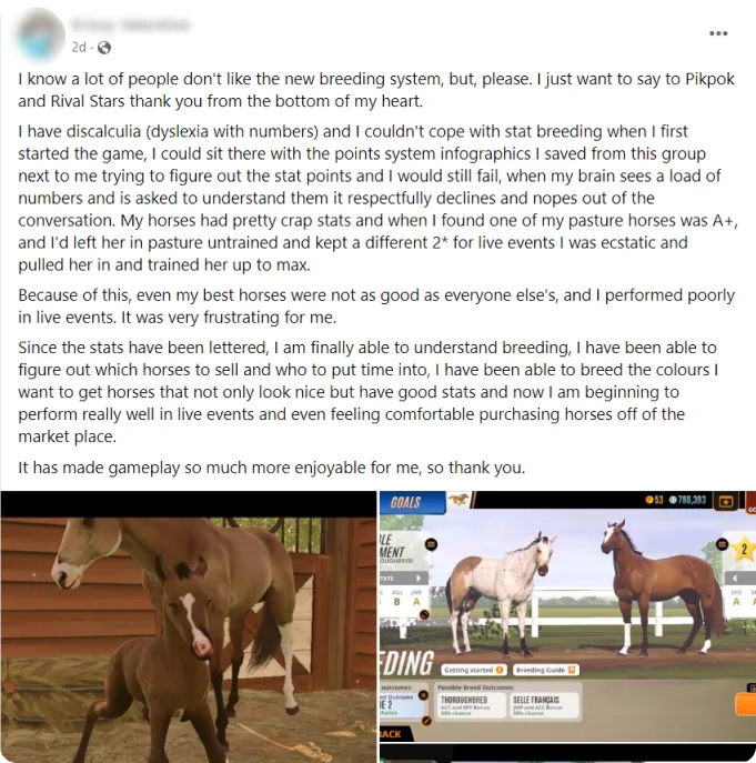
"I have dyscalculia (dyslexia with numbers) and I couldn't cope with stat breeding when I first started the game. Since the stats have been lettered, I am finally able to understand breeding."
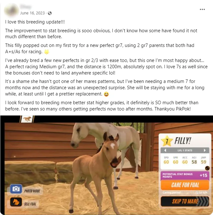
"I look forward to breeding more better stat higher grades, it definitely is SO much better than before."
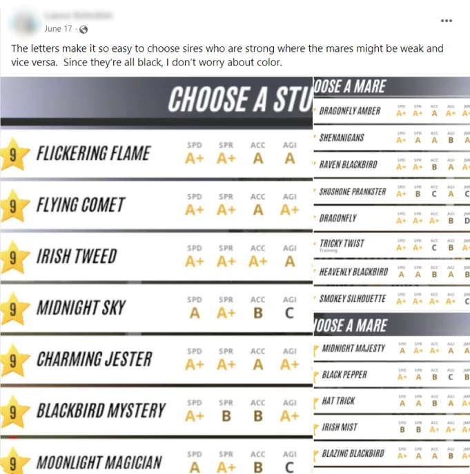
"The letters make it so easy to choose sires who are strong where the mares might be weak and vice versa."
"I'm enjoying the process much better with the new game breeding system... bred her back to the sire and got my 5A+ foal!"

Post-Launch Learnings & Design Debt
While the launch was overwhelmingly positive, making the hidden maths visible naturally exposed the underlying mechanics of the game's Random Number Generation (RNG), which led to new, highly specific community friction:
- "Why does A + A = B?"

The Transparency Trade-off: Making the hidden maths visible also exposed the game's deliberate progression constraints. Because the new UI was so legible, intentional economy friction-like stat penalties when breeding up a grade became glaringly obvious, causing new player confusion (e.g., "Why did two A+ parents make a B foal?").
Scaling for Complexity: Later game updates introduced new traits and bonuses that compounded the complexity of the grading system. Balancing increasing mechanical depth with interface clarity remains an ongoing UX challenge for the team.
New Player Overload: Analytics showed that introducing the Breeding Guide during initial onboarding caused cognitive overload. We patched this in a fast-follow update by delaying the UI prompt until players had mastered the basics.